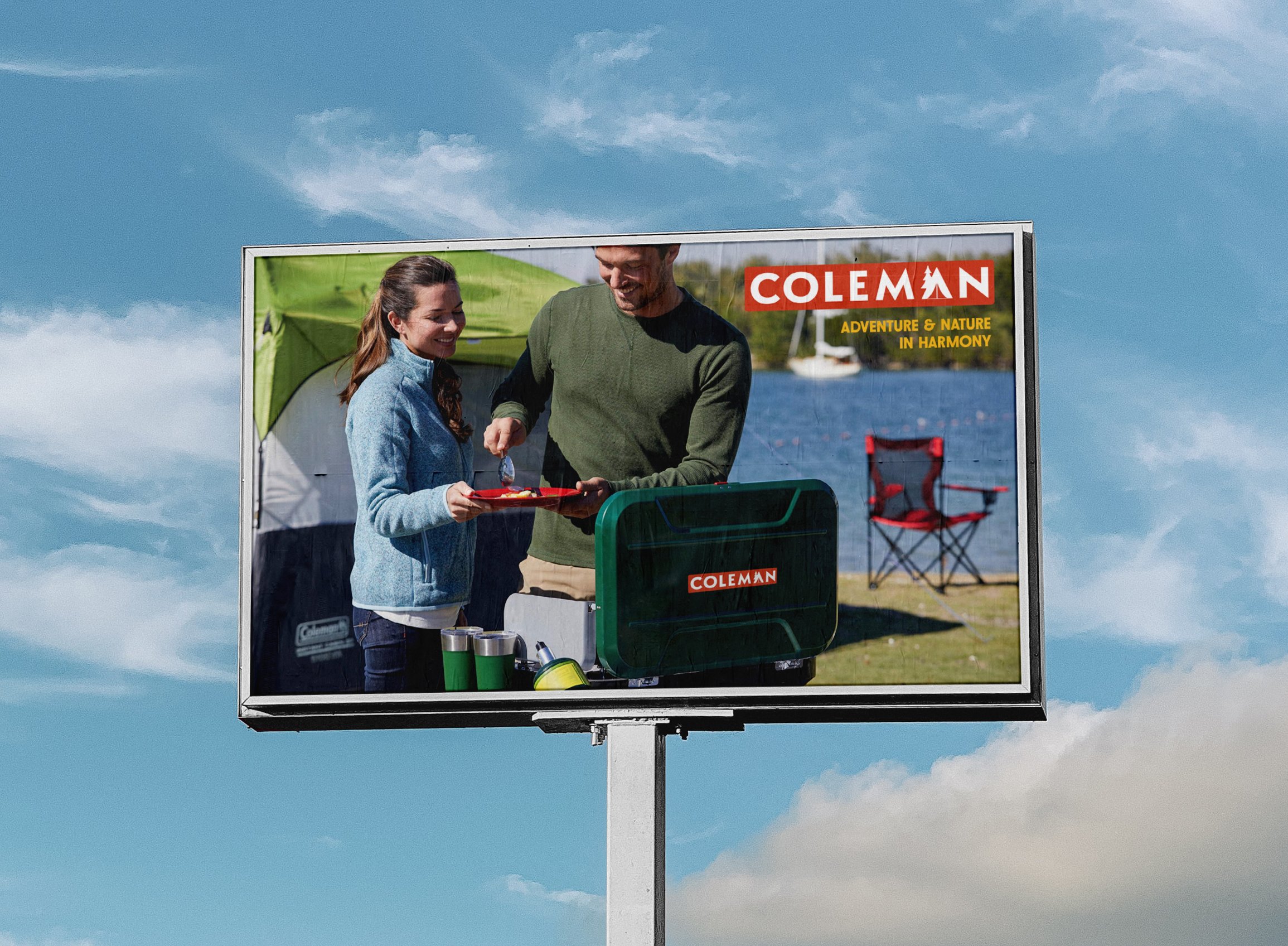
Coleman Rebrand
Logo Design
Collateral Design
Icon & Infographic Design
Print Ad Design
Tools: Illustrator, Photoshop
The challenge with this redesign was to modernize Coleman’s brand without eclipsing its heritage and history of quality equipment.
The new Coleman logo is simple, effective and no fuss, just like their products. I updated the classic darker red with orange-red to infuse the brand with a more youthful energy. The “A” tent and tree symbolize Coleman’s commitment to providing its customers with the confidence and peace of mind of reliable products so they can focus on enjoying nature.
The new logo is versatile enough to work in various colors and sizes and could include different elements around the letter 'A' to represent a range of products or seasons in future campaigns.


